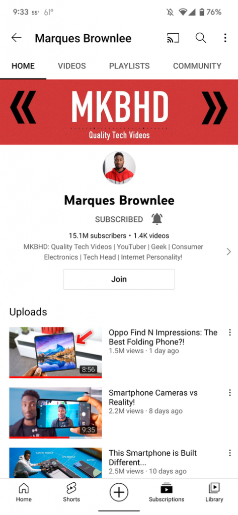
After introducing a bunch of new updates for the app that includes the removal of the gray status bar, full-screen feature, Youtube is now testing a revamped channel interface for Android application users.
As part of the latest test, Youtube plans to stress more on the channel’s profile picture by placing it in the center and upfront. The channel’s name will be positioned right under the profile picture. The ‘subscribe’ tab in bold red or gray will be retained along with the number of subscribers.

The newer homepage which is currently being tested will display the number of published channels by the creator and a brief channel description. Some of the additions include tapping on the description that leads you to the ‘About’ button for a full view of the channel information.
Also Read: YouTube unveils India’s most popular creators & videos of 2021; gaming and women creators take precedence
Moreover, Youtube plans to have a separate ‘Join’ link button that gives viewers the access to be paid members of the channel for exclusive content. With these changes, the Uploads tab and most recent video feature get almost out of view from the homepage. The header section of the channel will be centrally aligned unlike earlier which was placed on the left.
According to 9To5Google, this new updated YouTube channel homepage UI feature is live for select users with the app version 16.49.37, but it doesn’t seem to be out for everyone as of yet.
The updates are being tested and Youtube hasn’t stated on record about the developments on the homepage revamp update to roll out in the near future. However, the feature will only enhance the creator and channel presence highlighting the key objectives that it aims to fulfill. The platform aims to put the spotlight on the channel interface with revamped designs and updated features. The social media giant has been constantly working towards launching user-friendly updates on a regular basis.


